Our New Look
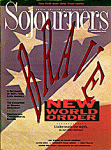
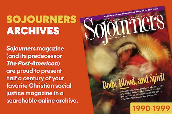
If you think this issue of Sojourners is brighter, more inviting, and easier to read, you must have picked up the wrong magazine. No, just kidding. This is the first issue of the long-awaited Sojourners Lite. New format. Bigger graphics. More white space. And less filling. So no more complaints about long articles, or page margins so small that your thumbs always covered up type. (We used to read our issues on a music stand; didn't everybody?).
It's all different now. We even have new departments, such as a lectionary section that pastors can read out loud on Sundays (instead of preparing their own sermons). And a grassroots news section, and an extra page of editorials. And a food page. (A food page? Don't ask me, it wasn't my idea.)
Feature articles will be shorter (they couldn't get much longer...) in hopes that they can be read in a single sitting, instead of stretched out over a semester.
And white space. We got some white space. Lots of white space. El blanco grande. Vast, empty plains of white space. Yawning, horizonless voids of white space. Changeless gaps of colorless abrogaciousness (is this thesaurus great, or what?!).
The contents page has been redesigned so you can actually find things in the issue. (Nobody ever told me what that page was for until now, so I naturally assumed it was just a place to put extra type that was too small to read.)
All in all, the new Sojourners is going to be more reader-friendly, especially to long-term subscribers. (Short-term subscribers may find the changes merely reader-congenial.)
But more important, H'rumphs is now--and forever--a full page. Amen.
Finally, a full page of unabbreviated fun from one of the nation's greatest humorists. A full page of cutting-edge comedy. A full page to try the untried, to breach the barriers of punchline conventionalism. A full page to explore the new frontiers of laughter.
Knock, knock....
Peace in the Middle East?
The world is holding its breath for a possible lowering of tension in this war-torn region. At press time, negotiations were continuing in the peace talks between delegations of Israelis, Palestinians, and other key players in the Middle East.
Discussing ground rules for the negotiations, Israel revealed an unexpected openness by insisting only that the Palestinian delegation dress in black, wear Groucho Marx glasses and fluffy pink bunny slippers, and speak in French. Israel's delegation dropped an earlier requirement that no PLO representative look like Ringo Starr [Yasir Arafat joke].
In another encouraging compromise, Syrian President Hafez Assad agreed to temporarily recognize Israel as a state, but only if he could hijack something. A weary Secretary of State James Baker agreed, but limited Assad's choices to a bakery truck or a Congressional fact-finding tour.
Iran issued its predictable denunciation of the talks, but experts saw some signs of hope in the fact that the Teheran statement used the word "demonic" only 18 times, and referred to "Satan's dog" only twice.
Meanwhile, the Iranian-backed Islamic Jihad moved against Spain, the first host country for the peace talks, by kidnapping pop star Julio Iglesias. They figured since he spoke Spanish, he must be from Madrid. They were wrong, of course, but music critics wasted little time in praising the action.
And Further...
The Middle East talks may have grabbed the world's attention last month, but the other big story also came from that region. The Dead Sea Scrolls, long held in secret by the Antiquities Society, have finally been released to the public. Biblical scholars hailed the move and quickly launched their long-awaited scrutiny of the original manuscripts.
Expressing initial surprise that the Scrolls were actually typed, and not hand-written as earlier believed, scholars nonetheless plunged ahead for further revelations, discovering, among other things, that:
· The Song of Solomon was actually written by Irving Berlin.
· King David, in his younger days, didn't play a harp; he played banjo.
· Noah deliberately over-booked the Ark, and shoved off before the unicorns even made it to the gate.
· When Jesus raised Lazarus from the dead, he sent him back into the tomb to "put a decent shirt on."
· The gospel reference to Jesus and the children is actually: "Suffer the little children to come unto me...one or two at a time, with last names beginning with the letters T through W."
· Paul's third letter to the Corinthians was returned, unopened, with a short message hurriedly scrawled on the envelope, stating: "Hey, you think all we do is sit around readin' this stuff. Some of us have to go to work in the morning. Yo, Paul...get a life!"
· The Apostle John's vision of the end-time came after eating a late-night TexMex dinner with extra hot sauce, which he swore he'd never do again so close to bedtime.
Ed Spivey Jr. is art director of Sojourners.

Got something to say about what you're reading? We value your feedback!
