New Look, Same Attitude | Sojourners

New Look, Same Attitude

Funny business by Ed Spivey Jr.
Ken Davis

IT'S NO SURPRISE to my loyal readers—both of them—that when I’m not writing this column, I’m spending the other 97 percent of my time working as art director for Sojourners magazine, the magazine you are now holding, or perhaps reading on the floor, if you’re doing planks. (I used to do planks every morning but stopped after the internet said that planks are less important than a healthy breakfast. I think it was an ad for Egg McMuffins.)

The fact that I’m the art director is actually printed at the end of my column but, let’s be honest, how many readers get that far?

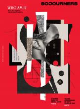
I mention my day job to point out—if you haven’t noticed yet—that Sojourners has been completely redesigned. New logo, new typeface, lots of white space. We did this on your behalf, not because you asked for it, but because we thought it makes the magazine more interesting and readable. So, you’re welcome.

I’d like to say I did the whole project myself (I said it out loud in the shower just this morning), but it would be less than true. I wanted to, but the editor distracted me with sugary snacks, then asked me to pick up his dry cleaning, in Nebraska. By the time I returned, Metaleap Creative, a professional design firm, had completed most of the work. It’s a shame I missed it, because I had some new ideas of my own like ... like ... well, it’s too late anyway.

To be clear, I was an integral part of the process. I distinctly remember nodding significantly at several points in the discussions, and at one crucial meeting I even briefly looked up from my doughnut.

The new design pays homage to our earliest days of publication, when the magazine was on newsprint, the graphics were big and bold, and the editors frequently asked, “Why write 600 words when 2,000 will do?” We were loud, we were proud, and we were wordy. Although we’ve left behind the longer word counts—it turns out pithy is better; who knew?—the new Sojourners recaptures the energy from those early years that still drives our work for justice.

The cover of our first issue in 1971 depicted a mournful Jesus covered in an American flag, calling out the shame of a church supporting an unjust war. The temptation today is to run that cover every issue, expanding the list of causes for Jesus’ lament to include racism, economic inequality, and environmental calamity, to name but three. Turns out, our magazine still needs to be loud and proud of our calling to biblical faithfulness, and our new design is part of that commitment. (And if it makes us look cool in the process, well, it can’t be helped.)

Sadly, with its emphasis on graphics, there’s less space for words. But for my
column, we’ll make room. Because when it comes to compelling, award-winning prose, there can never be a limit on how much the

This appears in the July 2019 issue of Sojourners