Aaaaaah. Its nice to stretch out in all this extra space. Our new format gives "Hrumphs" eight more inches, a whole column of additional fun, which literally tens of our readers have asked for. Unfortunately, it also gives the food section more space (todays recipe: Yummy Compost Burgers).
But seriously, this months food column talks about the importance of cutting back on fat. Well, I have a confession to make. This is not easy for me to say, but when I was in college I actually tried some fatty foods. I was at a party with a bunch of friendsyou know how it is when everybody else is doing it. But I swear I didnt swallow.
Getting back to our new format: most of the changes came after talking to some of our readers. They said the magazine was a little hard to read because of too much type on a page. We knew this couldnt be true, so we talked to some more readers, but they said the same thing. So then we talked to some others and surprisingly, they also were wrong. (We tried very hard to find readers who actually like pages and pages of type, but found only one person. It turned out he works for Sojourners.) In short, no matter how many readers we talked to, they all complained about too much type on a page. They were really getting on our nerves.
But which would you rather have, happy readers or happy writers? Me too. Hence, our redesign.
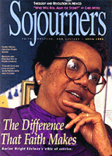
About the cover: Actually, we hadnt planned to change the cover logo. We prefer it nice and wide, but somehow it got caught between a couple of really long articles and ended up sort of squished.
Read the Full Article
